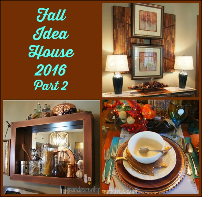
This is the second in a series of peeks into an Idea House full of beautiful decor and vintage finds for the fall season.In Part 1 of Fall Idea House 2016, I mentioned all the layering that I saw. That trend continues in Part 2 as well. Notice, also, the cool blues and mixed metals.
Remember, it’s a group of decorators that transform this house three times a year with “what’s new” and repurposed items. I’m taking you on this visual tour of ideas and sharing what I’ve found. Everything is beautifully done. Let’s go…..
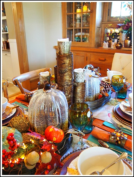
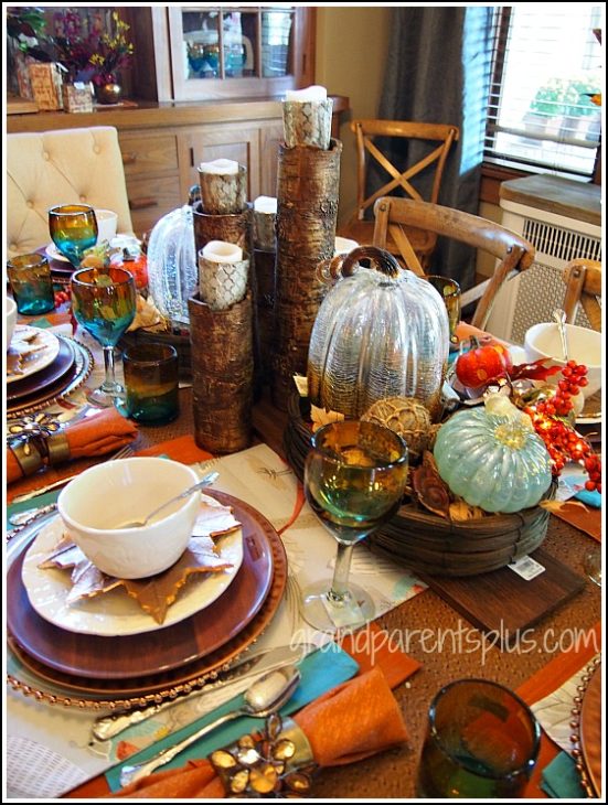
First, as you enter this house, the dining room is the room that you notice. The centerpiece on the table is elegant and has lots of texture and cool blue color. The tall birch-like vases are filled with any filler (beans, rice, etc.) and then a votive glass sits on top!
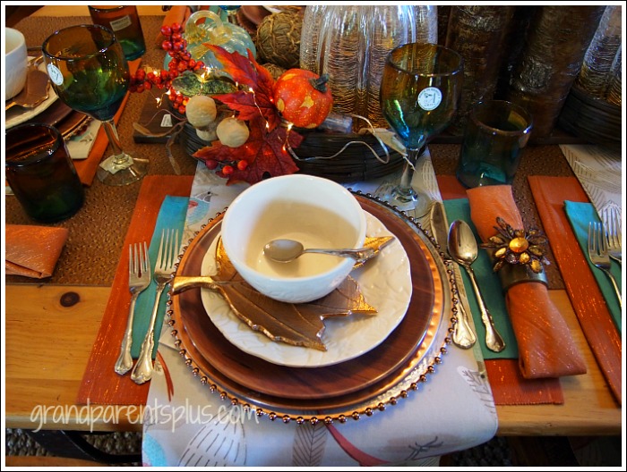
Here’s a close up of the layering on the table and place-setting. Wallpaper or even wrapping paper would work, too!
Look closely at the centerpiece….. bring out those tiny LED lights and use them anytime to make a centerpiece sparkle!
In this picture, you can see the wood plank that the centerpiece sits on. It adds another layer to the center of the table.
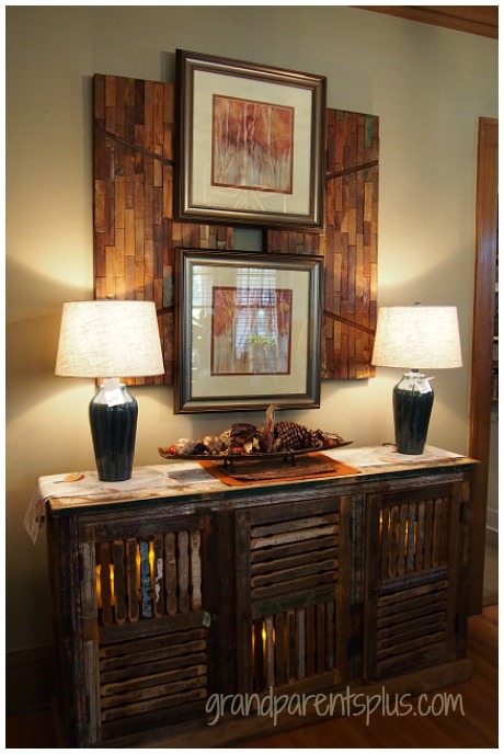
Above the buffet, the two pictures alone on the wall wouldn’t look balanced, but by layering with two wood pieces, it looks just right in proportion to the space. (another layering idea)
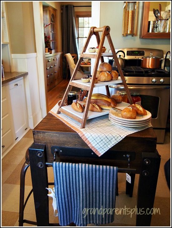
Next, we walk into the cute vintage kitchen. In the center is a small vintage looking chopping block. Looks like breakfast is being served to guests!
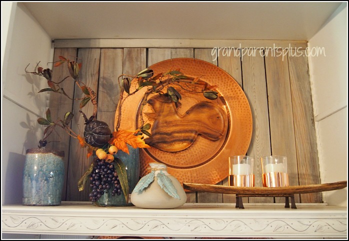
Salvaged wooden planks line the open shelving. A large copper plate with a wooden squirrel serves as wall art.
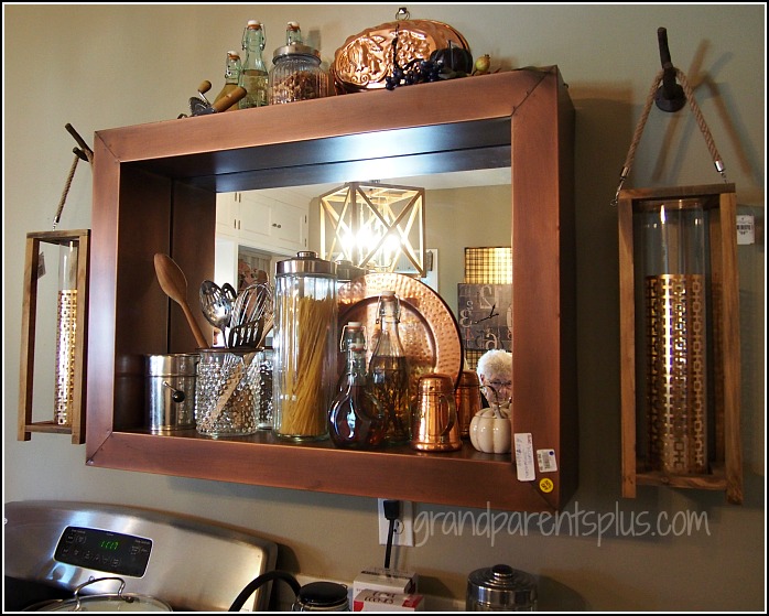
A deep copper mirror provides a wall shelf above the range. On each side, decorative copper lines the candle holders, too.
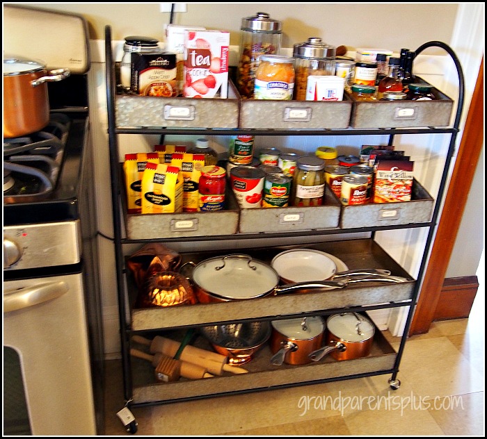
One the side of the stove, a vintage shelving unit serves as an organizer for kitchen supplies.
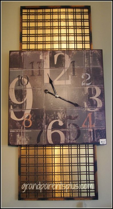
Here’s another example of layering…. The wall clock is attached to a salvaged metal grid and under it all is a piece of copper.
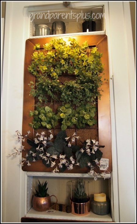
This copper wall planter filled with herbs is another metallic accent.
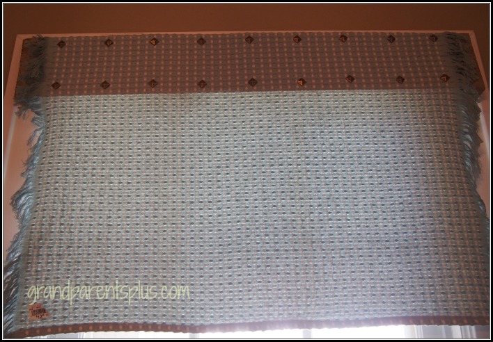
This is not the best picture, (I apologize) but I wanted to show this easy idea for a curtain. They used a dish towel and attached it to a piece of salvage wood with upholstery tacks. EASY!
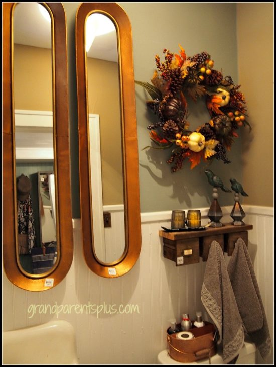
In the small vintage bathroom, there are two mirrors side by side. Above the stool, three small repurposed drawers are topped with a salvaged board for a shelf.
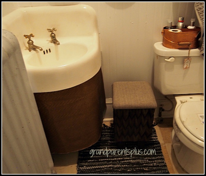
The old vintage sink is skirted with a copper metallic fabric to hide the plumbing in keeping with the metal theme.
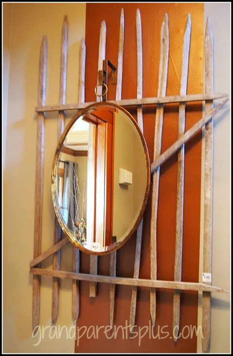
In the hallway to the upstairs bedrooms, there are large rectangles painted with copper paint. Then, it is layered with an old fence section and topped with a mirror.
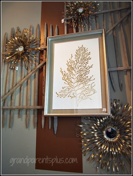
The last idea for this post is at the top of the stairs. The same theme continues by using a large copper painted rectangle, two fence sections, three metal flowers and a coordinating print. The end product looks beautiful!
Remember, when you don’t have the right size piece for a large wall space, think of how you can layer and make it work!
Happy Decorating!
Phyllis
You’re invited to subscribe on the sidebar so you don’t miss a post! Your email is never shared or sold!
Follow on Pinterest and Bloglovin, too!

